 |
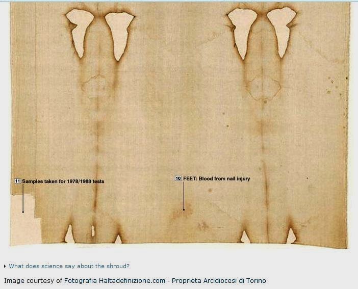
| Shroud of Turin frontal image. Can you guess the provenance? Click to enlarge (look closely at chest, cheeks etc) |
 | ||
| Shroud of Turin, dorsal image. Again, can you guess the provenance? Click to enlarge. (Look closely at shoulders* etc). |
It's been said the TS image is "homogeneous", an observation deployed (quite rightly) - were it true - in the recent past against the claim of STURP's sadly no-longer-with-us Raymond N. Rogers that it was formed by post-mortem decomposition process, one that was dependent on interaction between putrefaction vapours (ammonia, cadaverine, putrescine etc) and 'impurity' coatings on the linen .
Personally, this blogger has never bought into that scenario, for reasons enumerated previously in some detail here and my other specialist 'shroudie' blog that need not concern us now.
These two images show in my humble estimation that the TS image, whether imprint or painting (I still prefer imprint) is most definitely NOT homogeneous. Under the carefully adjusted contrast, brightness and mid-tone settings, but emphatically with NO fiddling with colour, they show some "grey" areas and some "orange-brown" areas, admittedly an approximate description.
The effect is seen better on the second (dorsal) of those two images.
*And if anyone says it's "just" blood, I have another image, ready and waiting, to kick that suggestion into the long grass. (Sorry about the idiomatic English - I only use it when animated, and I have to say that fellow shroudies sometimes get me animated, not to say pissed-off, with the dismissive put-down tone of their comments).
Following a recent line of enquiry, set out in some recent postings, I think I may know why. Details to come later.
For now, let's just content ourselves with the two new images, and hang loose for a while, if only to tease my readers (to say nothing of play for time).
Here's a challenge to fellow shroudies: whose images were these originally, and where did they first appear, before I began to tinker with them in MS Office Picture Manager (legitimately I maintain). ?
More to come (at leisure). ;-)
Like now (19:20 day of posting)
 | |||
| There's another image from the same source, same adjustment of brightness, contrast, mid-tone in MS Office Picture Manager. Note the two- tone effect. (Click to enlarge). Has anyone reported that previously? Is the TS image really "homogeneous" as claimed? |
21:10 Here's a comment I tried to post a few minutes ago to shroudstory.com that "failed" to send (not for the first time). It was addressed to the site owner's personal friend (John Klotz) - I was told as much in an email - whose pretentiously, not so say obscurantist entitled book (self-publication) has recently appeared.
"Why anyone would choose to write a book while the facts are still coming in (albeit not as quickly as one would prefer) is a complete mystery to this blogger. That applies especially to lawyers who deploy the adjective "quantum" in the title of their book in relation to the TS, but who fail to deliver on that pseudo-scientific eye-candy (as a first-impression commentator recently felt moved to point out, though thanks to the author for volunteering that information - there's hope for him yet).Einstein admitted to being unable to embrace quantum theory, or even get his mind around it. ("God does not play dice" etc). Why should we ordinary mortals imagine we can succeed when a gigantic intellect of the 20th century was left totally bemused?"The only good reason I can think of for the human consciousness to operate on a quantum-physics principle is that we are stuck for a means for exploring our own consciousness. It's like an introspective whale or dolphin, wondering why it is confined to the sea, and can't join (or re-join) the other mammals on land. Answer: it's a question that is not worth addressing. Move on. Address those questions that ARE worth answering. Junk the term "quantum" unless one has something useful to say."
Wednesday 22 October
Before amassing and displaying more visual clues to inhomogeneity (yes, that's really all one can say with certitude - we are looking at clues - one needs a theoretical model (or models) that tries to make sense of what one is seeing, and hopefully suggests further lines of experimentation. That's my understanding of the scientific method - start with observational data first before getting too attached to theories.
So, by way of preparing the ground, so to speak, for a presentation of ideas and interpretation, coloured no doubt by past experience(s), here's something I put together last night:
Stepwise evolution of
thinking over the last 3 years approx.
Mark 1 hypothesis – having quickly shelved radiation/thermostencilling, assessing the merits/demerits of
the TS image as a simple contact scorch
Mark 2 hypothesis: Might
there be a way of achieving the same scorch intensity at a lower temperature? Experiment with invisible ink (lemon juice, in
2012) .
Also experiment with one-cell thick dried onion epidermis as
an overlay, which also takes an intense brown coloration (Maillard reaction )
with scarcely any effect on underlying linen
Mark 3 hypothesis: Given that the
invisible ink effect with lemon juice is not due simply to
acid-etching (citric acid) but to a more complex mechanism involving ascorbic acid, (Vitamin C) which is believed to thermally
decompose to give a four-carbon reducing sugar (threose) and thence a Maillard
reaction with accompanying protein etc.then...
Maybe the TS image is a
Maillard product, not formed in 1st century as Rogers proposed,
using a corpse and its putrefaction products interacting with
starch-impregnated linen, but from 14th century linen impregnated
with a mixture of reducing sugar and
protein (e.g. milk or a mixture of lemon juice and egg white etc)
Maybe there are areas on the
TS with the imaging medium in both states, pre-and post
development, dependent on contact with heat (either from a template, or the 1532 fire or both). In other words, imprinting of the TS image required the presence not just of heat (simple non-nonsense scorching) but prior impregnation of the linen with a thermosensitive substance, modelled for now as "invisible ink" with milk or lemon juice (possibilities abound for creating a two-component Maillard reactions in situ).
OK, let's now take a look at another image from the same brightness/contrast adjusted archive as the ones above. It's the dorsal legs.

Note the same two-tone effect as regards body image (grey/red-brown), not helped by the abundance of scourge marks in this location, but I maintain a real property of body image, distinct from blood.
Note that the grey component of the body image is NOT restricted to the legs in this graphic. There is lots of it elsewhere. But why? Does that not suggest that the entire linen was first impregnated with the thermosensitizing medium, and that while it has shown maximal 'development' (by analogy with photography rather than thermography) it is NOT exclusive to the body areas. Note especially the wide band of grey on both sides of the vertical scorch line on the right hand side, the latter due to trh 1532 fire and the way the linen was folded in the reliquary. Is there not some prima facie evidence there for some heat 'development' having occured along the fold, such that the coloration now resembles that of the legs? There are other more diffuse, somewhat patchy areas elsewhere, all suggestive of "background colour" that has ofetn been remarked upon as reducing the tone difference between image and background. Maybe the background was not pristine untreated linen - but maybe it was impregnated with something other than Rogers's starch impurity coating. Maybe both ingredients for a Maillard reaction were present, needing only a temperature rise (less than needed to scorch untreated linen).
So how do we explain the two-tone coloration?
Let's take a closer look at the TS face - where it's easier to be sure what's blood, what's not:

(The image on the right is 'as is' from my re-discovered archive, i.e. before adjusting contract and brightness to reveal the apparent colour difference. Interestingly - and reassuringly- the red-brown coloration of chin, cheeks etc is faintly visible , note, BEFORE making those adjustmnents).
Note carefully the parts of the face that appear red-brown instead of grey. Is there anything about those parts that might make them behave differently in an image-IMPRINTING scenario, as distinct from a simple painting?
Here's an enlargement:

Rest assured it's still a valid TS image, based on what one sees when entering into tone-reversal in Image J:

... and after 3D enhancement in the same software:

08:48 What follows will come as no surprise to those familiar with this blogger's particular 'line' on the provenance of the TS image as an attempt in medieval times, probably early or mid-14th century, to simulate a sweat imprint, using a template or even real person to imprint a negative image from the most prominent body contours. The red-brown regions are precisely those parts of the human anatomy that would make best contact with linen. I propose that the red-brown areas represent slightly-scorched linen fibres, while the grey areas represent unscorched linen, the colour being due to a deteriorated Maillard reaction product formed on and still adhering to the surface fibres. In other words, the TS image is a two-tone composite,.
10:54: So what did I do to 'enhance' those TS images, and was the two-tone effect real or artefactual?
I've already pointed to strong evidence it is real, based on there being faint yellow-brown coloration in the starting TS image BEFORE applying those new values for brightness, contrast and midtone value. First, let's give some more detail on that. I used Microsoft Office Picture Manager, and set the three values, originally all at zero to 30,36 and -100 respectively. Reminder: there was no direct adjustment of colour.But what one might ask would those three new settings do to a modern image with plenty of colour, displaying a range of RGB values and intensities.
That's easy enough to check. I went through my recent photographic archive of experiments for investigating in situ Maillard reactions, and pulled out one for use as a reference standard. Here is, before and after applying (30,36,-100).

As you can see, all the adjustment has done is to increase the saturation of each colour, but has NOT materially altered the colours in any obvious manner. All it does is to make faint colours and faint stains look more prominent. That would strike me as a necessary step for any serious analysis of the TS image, given it's initially faint almost to the point of invisibility.
In fact I could have used a direct saturation control on different software, e.g. MS Paint, but chose not to, since that was part of the colour-editing package. I did not want to alter colour, only saturation, but more importantly did not wish to be accused of playing fast and loose with ANY control options listed under a colour menu.
Incidentally, if new readers to this site missed my posting on the above experiment, the impregnation codes (i.e. after soaking and drying) are: EW = egg white, ASC = ascorbic acid, EW1 + ASC2 =egg white applied first, then ascorbic acid, ASC1 + EW2 = ascorbic acid first, then egg white, CON = water control.
Heat was applied with an ordinary electric iron. Actual temperature? Dunno. Hot enough to produce a very faint yellowing on prolonged pressing against linen, but not sole-shaped scorch.
Needless to say, I shan't be deflected from my task by facile talk about "hidden artefacts". I've been conscious of that risk from the word go, and have been doing and talking about the kind of internal checks that are second nature to anyone who has spent their entire career in and around research laboratories.
I still haven't said where I obtained the base image, which you see has been pre-labelled at source. Clue: it was one I considered state-of-the-art before the IPad's Shroud 2.0 was released, before Mario Latendresse's splendid ShroudScope (don't ask!), even before I badgered David Rolfe for more of the HD pictures he was using to adorn his Shroud Enigma site. Has nobody recalled where they last saw that labelled image, and what it now is in its modern guise?
12:45 So can the same two-tone effect be obtained with Shroud Scope? Answer: no, except with the eye of faith, and tilting of laptop screen, when there is a vague impression of reddish or yellow-brown on the prominences of the face, but less so the hair.

Why should the effect be seen so better in the first image selected for study? Ah, that would be telling.
13:40 Got to wondering of there might be a Shroud 2.0 image going for free on the internet, given I have no iPad or Android (and am in no hurry to get one, having discussed pros and cons with owners).
It didn't take long to find a site that has exactly what's needed, albeit with a little cut, paste and crop (all for legitimate research purposes):

I'll be back later, after seeing what can be done with that image you see left of centre.
13:50: Here's the excised image:

OK, let's enter it into MS Office Picture Manager and see if it reproduces what we've seen earlier. It should.

Maybe a little reddish-brown in beard, relative to hair, on (-28,62,-21) but one has to know what to look for. It does not leap out of the page. Maybe a close-up of the 'critical' face with its angular prominences is needed.
14:30
It's not been easy. There is no perfect combination of settings. However, here's on (18,12, -97) that is reminiscent of what was seen earlier, with a generally somewhat grey and patchy body image (greyer still outside) in which the extremities, or at any rate the chin appear as red-brown, distinctively different in hue from the lank hair.
 |
| Note the blotchy grey that surrounds the image, which I interpret as the remnants of thermal-sensitizing medium used to impregnate the linen prior to imprinting. |
AS I say, I'm a little surprised and disappointed with that HD Shroud 2.0 image, for reasons that will be clear shortly. But then it was only an ad for 2.0. so may have lacked the "HD" (High Resolution) of what can be downloaded to one's iPad, or, in an earlier era... Maybe resolution is critical to spotting the two-tone effect. Maybe that's why it's been missed previously, by myself and others.
15:00 So why am I a little surprised and disappointed,
Well, it's like this dear reader. Some time before this blogger got (re)-interested in the TS, post the 1988 C-14 dating, there was an article on the BBC's site by one Tom de Castella. It was dated 12 April 2010. (Tom de Castella? OK, so an Englishman's home is his castle, but one does not need to brag about it - certainly not by adopting a surname in feudal Anglo-Norman French).
Stand by for a screen grab.

But there was a companion page too. Stand by for another screen grab.
It was called "Unshrouding the science of the Shroud":

Is that a TS image I see there? If so, whence its provenance (that term being employed in a strictly archival sense)?
Let's look down at the bottom of the page. Hopefully we'll discover the provenance of that image has not been altered since this blogger's eye first alighted on it yesterday morning, resulting in this unforgivably overlong posting.
What's that say, right down at the bottom there ? "Image courtesy of Fotografia Haltadefinizione.com. - Proprieta Arcodiocesi di Torino". What could that mean, I wonder? Will need to get my Italian dictionary out...
16:10: Fancy. That's the same folk (in a cosy relationship with the Turin TS custodians) who now do the Shroud 2.0 app for iPads ("enter your credit card details").
Well, would you credit it? There we were, assuming that HD Shroud 2.0 was only available on iPads, at a price, when all the time it was there at the click of a laptop key on good ol' Auntie BBC, going way back to 2010.
It's a funny old world.
16:25
OK. End of tease. My TS image was essentially Shroud 2.0, made available to the BBC in 2010 well ahead of the better-known release of the iPad app that we call Shroud 2.0. But it's the same image from that HD (high definition) photography that, with a little intensification of existing colour ("saturation") shows the TS image is in fact TWO-TONE.
Has anyone said that before today? Maybe. If so, I must have missed it. Does anyone else recall hearing the TS image described as two-tone?
17:13 This comment from Hugh Farey has just appeared on shroudstory.com
October 22, 2014 at 12:04 pm
Colin’s pictures are from Haltadefinizione’s Shroud 2.0 projected as labelled by the BBC at http://news.bbc.co.uk/1/hi/world/europe/8612315.stm. Although I can’t swear to having seen them before, they have been there since 2010…
Back to blogger:
Back to blogger:
Well, I've certainly got something right today, having told my wife some hours ago that if anyone could correctly identify the source of my input image, it would be the inestimable Hugh Farey.
18:35 Sadly there are some folk who confuse high resolution with high magnification.
If one's interested in the colour differences that exist between one part of an image and another, viewed with the unaided eye, then one has to choose the appropriate level of magnification. There's no point in going to a high level of magnification (no matter how good the resolution) if one can no longer discern the image.
One needs the appropriate level of magnification where image analysis is concerned (excluding studies at the microscopic level re degree of superficiality etc where the outlines of the image are no longer visible). Having fixed on the optimum level of magnification, one then desires the maximum level of resolution (i.e being able to distinguish between two close features).
Takeaway message: the TS image is a composite, which with enhancement of colour-saturation in MS Office Picture Manager appears to comprise an orange-red region at the most prominent parts of a 3D figure (
Late addition: oops, curiously NOT the nose as I first stated mistakenly. That's a bit of an embarrassment re identifying the rosy-coloured regions as those with the highest relief.
Interpretation of these differences is an ongoing challenge, possible pointers to which have been included into this blog posting.
These preliminary findings and their interpretation may need to be qualified or modified in the light of further findings, especially if or when data become available from a new round of tests on the actual Shroud
.
End of post. Comments invited.


No comments:
Post a Comment